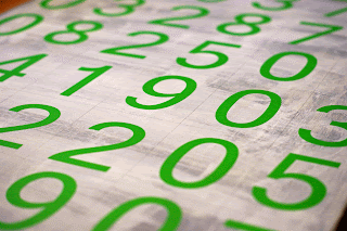
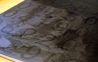
Each row of numbers on this canvas is important to the members of my family (they are all of our birth dates & our wedding date)...but what I like best is that the meaning isn't overtly obvious...in fact, it's subtle enough that I don't feel weird about hanging it in my living room...
First, let me show you where I got my initial inspiration for this project...
As soon as I saw this art from Andrea Steed, I knew I wanted to do something similar...
So here's what I did...
I found an old canvas that I bought a few years ago...mine was 24"x30"...grabbed some white, black & grey (not shown) art paint...and got to work.
First, I quickly (really quickly) painted the entire canvas with a coat of grey paint. It wasn't perfect, and it didn't need to be...you'll see why in a minute.
When that dried I went over the grey with white - this coat was even sloppier than the first...I didn't worry about completely covering the grey, because I knew I wanted the grey to show a little...
Then I marked off the canvas into equal parts with a ruler & pencil, making sure I had enough room for all of my dates...don't worry about the pencil lines...they'll be covered...
Next I used my Silhouette to cut out the numbers I needed from vinyl...but you certainly don"t need a Silhouette for this project. You could free-hand the numbers or print them out in a font you like, then cut them out for the next step...or you could buy the numbers from a craft or home improvement store...
I took my numbers and placed them onto my canvas...making sure that all of the edges were firmly pressed down...
Then I took my black paint and went over the entire canvas...I made sure the black completely covered all of the grey/white areas, including all of the edges of the canvas, but you could choose to give it a little more worn/shabby look by just doing a sloppy coat over the numbers...
When the paint was completely dry, I simply peeled off the vinyl numbers...
I love the way it looks in my living room...it reminds me of the old arrival & departure boards at the airport...I think it gives just the right "urban" touch to this space...and it's wonderfully personal...bonus.


